[ad_1]
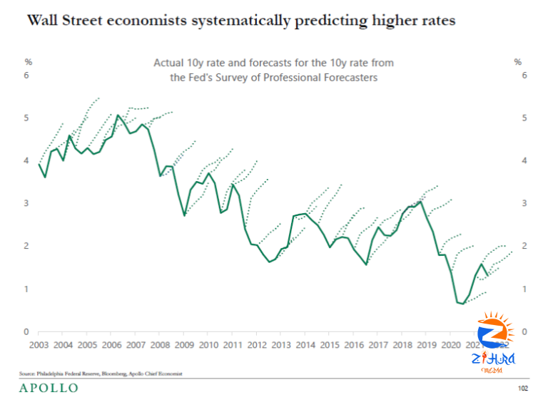
Torsten Slok passed on a lovely graph, created from the Philadelphia Fed survey of professional forecasters:
It’s not just the Fed, whose own forecasts and dot plots have the same characteristics.
Some potential lessons
1) Just you wait. There is the story of the hypochondriac, who when he died at 92 had inscribed on his tombstone “See, I told you I was sick.” More serious stories have been told of the 1980s high interest rates, worried for a decade about inflation that could have come but never did. Or the famous “Peso problem,” persistently low forward rates that eventually proved to be right.
2) A lot of fun is made in survey research about the “irrational” expectations revealed by surveys. Whether “professionals” are involved is often a used to select between “rational” and “noise” investors in asset pricing studies. Hello, the professionals are just as behavioral as the rest of us. As are the Fed economists whose forecasts look the same. The argument from irrational-looking surveys to let the “experts” run and nudge things never did hold water.
3) Just what do survey forecasts mean? How many of these Wall Street economists, or their trading desks are heavily short 10 year bonds? How many of them lost money on that trade for 20 years running? It’s a good bet the same economists work for firms that, to the contrary, have been riding this… well, call it a trend, call it a bubble, call it a golden two decades for long-term bonds. What is the risk premium story for believing long term bonds are about to take a bath, but buying a lot of them anyway?
4) Just what do survey forecasts mean? We ask people “what do you expect,” and scratch our heads that they do not reply with numbers that make sense as true-measure conditional means. The event of a sharp raise in rates might come with substantially higher marginal utility, i.e. a very bad event. Reporting risk-neutral measure, probability times marginal utility might make sense for many reasons. Reporting a 40% quantile, shaded to bad news, makes a lot of sense for many reasons. Clients who make money don’t complain. Clients who lose money do.
5) Just what do survey forecasts mean? For most surveys, the interesting thing is not the average but the astounding variation around that average. In theory, asset trading should lead to common expectations. In fact it does not. I would love to see the variation around this mean forecast.
Confessions. I’ve been … well, not forecasting, but doom and glooming about a sharp interest rate rise for just as long. And, I have to report, the graph has not yet changed my mind. To some extent, one faces the problem of the value investor, who every time the stock goes down has to say, “now it’s an even better deal!” I guess I have company. See, I told you I was sick?
[ad_2]
